Exercise 1: Object as a stand in for the body
Using clothing as a reference point, remake it either;
• In a different material; for example, brown paper, wallpaper, felt.
• Enlarge it; what would it look like at 5 times the size?
The aim is not to produce a meticulously. Choose a material that you know you can join and fix together easily; for example cartridge paper, masking and double sided tape. All materials carry associations so think about your choice and how this might add another layer of complexity and meaning to your work.
Sketchbook 1. Pages 18-23
Yinka Shonibare, MBE (b. 1962)
British/ Nigerian artist Yinka Shonibare explores cultural identity, colonialism and post-colonialism within the contemporary context of globalisation. Working in painting, sculpture, photography, film and installation, Shonibare’s work examines race, class and the construction of cultural identity. (Cohan, 2020)
A key material in Shonibare’s work since 1994 is the brightly coloured “African” fabric (Dutch wax-printed cotton) which he sources from Brixton market in London. From my own travels across Africa I would suggest that these fabrics are not traditionally worn by Africans in the twenty-first century, no more than men in London routinely wear a bowler hat. Shonibare claims that the fabrics were first manufactured in Europe to sell in Indonesian markets. As they were rejected in Indonesia, they were sold in Africa.. (Downey, 2004)
This may go some way to explaining the cultural crossbreed of bright colours entwined with nineteenth-century women’s fashion that was dominated by full skirts, bustles and petticoats as seen in The Three Grace (2001). (See figure 1) There is also a hint to colonial trade routes, wealth, power and inequality
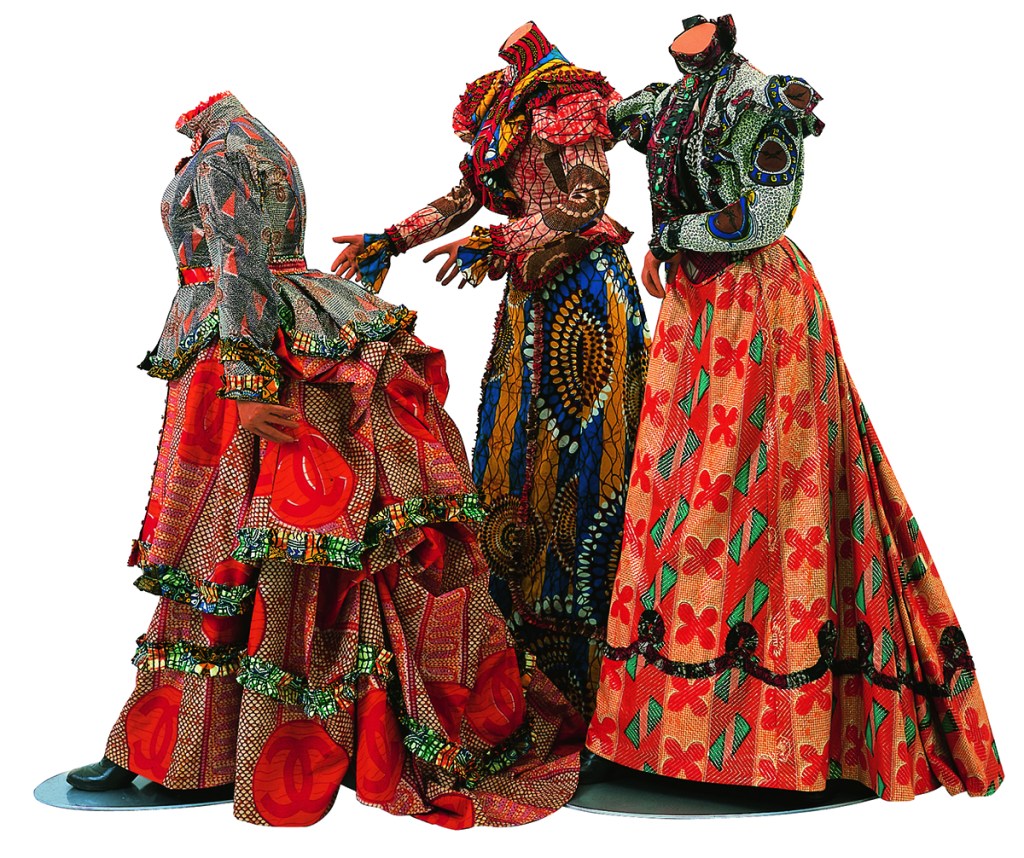
Printed cotton textile, three fiberglass mannequins, three aluminum bases
160.7 × 162.6 × 227.3 cm.
https://www.speedmuseum.org
Personal props – a hat and scarf
If asked to name a universal item of clothing it is unlikely that hat and scarf would spring to mind as your first choice, if at all. Apart from being seen widely as a fashion accessory of today, the hat was originally used as protection from the elements. With the development of materials and technology the wearing of hats became widespread, be it for social, cultural or a means of protection.
One of the first pictorial depictions of a hat appears in a tomb painting from Thebes, Egypt, which shows a man wearing a funnel-shaped straw hat, dated to around 3200 BC. Hats were commonly worn in ancient Egypt as a means of keeping cool. Indeed, it’s from my time in East Africa that I started wearing a straw hat and linen scarf; shielding my head, face and neck from the soring temperatures that averaged daily at forty degrees centigrade. (See figure 2) I had considered other clothing items but felt that my selection would also present an interesting challenge either to replicate or enlarge, or photograph ‘on location’.

Developing a narrative for my work ebbed and flowed, with factors such as available materials, construction and the government’s direction that we were stay at home. The use of recycled materials created its own dialog, although I wasn’t sure how this would relate to taking photograph’s in different settings.
My mind maps and problem solving can be seen at figures 3 – 5 (sketchbook 1, pages 18-23)


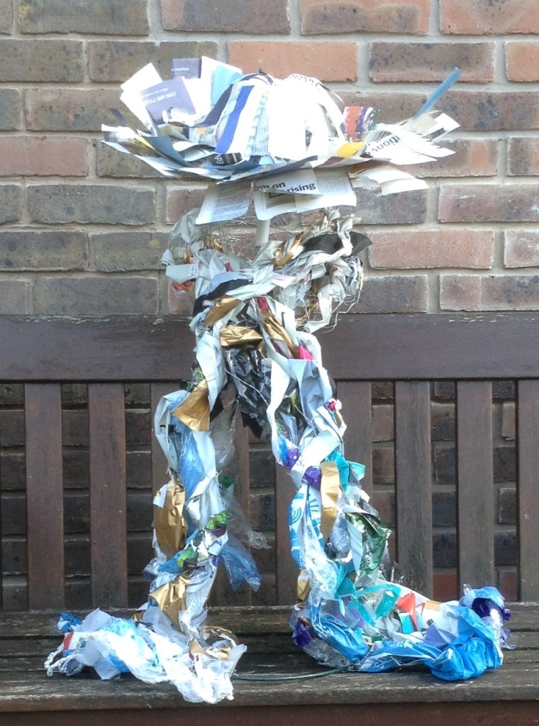
The raw materials from which to construct my object were: a hooped metal plant support, stainless steel wire, wire fencing, nylon cord, plastic wrappers and newspaper. To create a physical relationship between hat and scarf they would be part of the same structure, as if being worn and thus reflecting the presence of the human form.
Using the hooped metal garden support and stainless-steel wire, I constructed a frame. (See figure 6)

Having considered how this structure would support itself once constructed, I folded a length of stainless-steel wire in half and taped it together every 12 inches, or so. This continuous length of wire was then shaped to form the top part of the structure which was subsequently secured to the hooped metal supports. By placing items on the two stainless steel hoops I was able to adjust the counterbalance to prevent the piece from toppling over. Achieving this came with some relief as I had no idea if this would work.
Wire mesh was cut and rolled into a long cylinder shape before being wrapped like a scarf around the neck and attached to the frame. This added greater stability and strength to the frame. (See figure 7)

During the conception of this piece I had considered contrasting natural and man-made objects. I had considered using sticks, straw and even a living plant from which to construct the hat – but I could not justify this as a reason to travel and garner natural objects, and the plant proved too heavy.
I cut the plastic wrappers and bags into strips of random widths and lengths. These were then woven and folded into the wire mesh. (See figure 8)

To make a hat, an inflated balloon was placed inside the rim of a plant pot. Strips of newspaper were attached and glued using wallpaper paste, with the ends of the paper strips left loose to create a sense that the hat was light and cooling. (See figure 9)

The outcome was a hat and scarf, approximately four times larger than the original items of clothing. It was made from items available to hand, predominately, paper, plastic, and mesh fencing. (See figure 10)
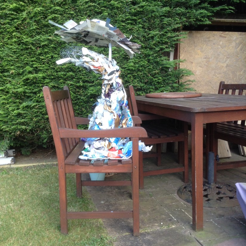
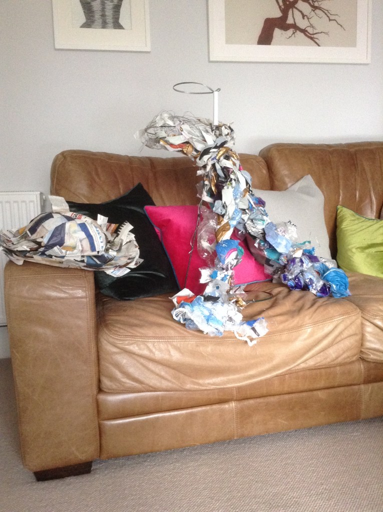
Locate the clothing
With limited options I took photographs of the items in a domestic setting around the house, garden, and car. Strangely, or at least unexpected, the hat and scarf developed a persona and presence that boarded a bizarre personality when staged in most settings, less so in the living room. A selection of photos is included as figure 11 below.


After reviewing the pictures of the hat and scarf in various locations, I made alterations to the hat. Cardboard was cut to shape and glued to the underside of the rim using PVA glue, and the loose ends were trimmed and curled so it mirrored the original hat. (See figure 12)

Painting in location
Having located the props in various domestic, everyday settings, I felt being around the dinner table created a sense of presence, especially when adding a few additional props. (See figure 13) Having previously worked away from home for up to twelve months at a time, there was also a personal sentiment to the setting; being present when physically being absent. This would be the setting for my painting.
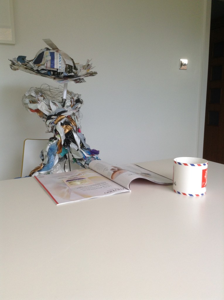
Using a charcoal pencil, I started with an outline sketch. The originally sketch and painting included the hat which I subsequently painted out as I felt it looked like it was floating – and a little too surreal.
The plastic used to make the scarf produced multiple glimmering surfaces, reflecting light from the white table and walls, all which blurred the lines and definition of form. I found it challenging to identify tonal variations within the plastics and thus resulted to coloured hues, as well as other objects in the setting to create depth and form. (See figure 14)
On reflection, although I was content with the prop scarf as a structure, it did not work well for the painting. I also felt that including a wider view of the setting (the dinner table and other empty chairs) it may have presented a stronger narrative.
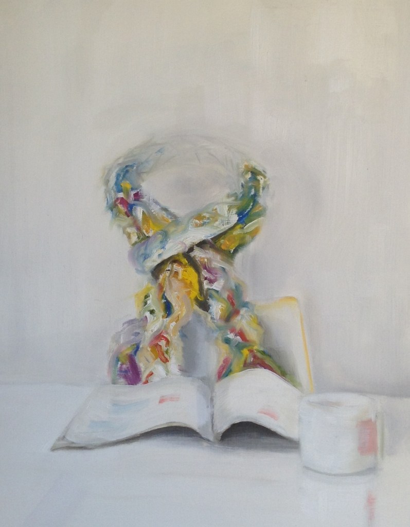
Oil on paper canvas
49×37.5 cm
Reflection
The examples of works by Philip Guston, Van Gogh and Lisa Milroy (OCA Studio Practice, Part three “Prop, performance, stage”, p. 58) are three quite different styles.
Vincent Van Gogh’s A pair of shoes (1886)
Van Gogh’s A pair of shoes (1886) create a personal connection between owner, shoes and the act of painting. The cracked sole and exposed nails tell a storey of them being well worn. Appearing as though they were cast aside where they were taken off would suggest these are very much practical every-day objects, rather than any prised possessions, yet they were important enough to paint. Their condition reflects his financial predicament, but they may also be a metaphor for his own personal journey and hardship. In reality Van Gogh purchased these worn-out shoes from a flea market in Paris. It’s not clear why he bought them, but it could be simply that he needed a new pair of shoes. Apparently, he did try to wear them and found the fit impossible. Instead, he decided to use them as a prop for painting. (Horton, 2009)
Van Gogh uses a monochrome palette of paint which has been applied thickly to create chiaroscuro and atmosphere. The visible brush strokes and thick application of paint creates a sense of form and substance, bringing the shoes, and their tails to life.

http://www.wikipedia.com
Lisa Milroy, Shoes (1985)
Lisa Milroy’s Shoes (1985) is a painting of twelve pairs of shoes; all the same style, painted in numerous positions. I tried to read the painting like a code or hidden message – with no tangible result. Perhaps each positioned pair of shoes reflects the owner’s mood, personality, an event, time or place. Whilst there is no indication of context, and each pair may appear to have been randomly placed, their spacing and positioning on the picture plane suggests is also an element of uniformity, structure, and forethought.
Like van Gogh, Milroy uses a limited palette. The thin application of paint is used to depict the soft outer of the shoe, whilst the subtle use of tonal variations and shadows create the illusion of a three-dimensional form. Single white brush stokes create the illusion of sheen and the reflection of light. Each shoe appears as it was created with one or two quick but measured brush strokes. The subtly of tonal variations would suggest that paints were mixed prior to being applying to the canvas.

Philip Guston’s The Coat (1977)
Philip Guston’s The Coat (1977) depicts the soles of three pairs of shoes face out from under the sleeves of a coat. The bold use of paint brushstrokes is also very visible. complexity in the application of paint with textures which look like they were arrived at by dragging paint and layering to produce monolithic structures. The grey paint of the coat and shoes is thick syrupy with black accents to delineate the nails, buttons and outlines of the coat and shoes. The paint is mixed on the canvas and applied in a scraping manner in the direction of orientation of the item. The purple/grey background is a lighter tone to the coat and shoes and is only separated by the opaque black line forming a hard border between the item and background.

Consider how you might work with colour when working quickly, do you mix paint prior to applying it or do you mix it on the canvas or paper? What are the advantages of each approach?
When working quickly with colour I tend to incorporate both techniques – pre-mixing a selection of coloured hues, and then making small changes when paint is on the canvas, as required. Mixing paint on the canvas may be more suited to a monochrome or limited palette like Van Gogh’s shoes.
When I have mixed paints directly on the canvas, I found myself with unwanted or unrealistic colours, often looking like mud, which I would then scape off. Further to this, if the desired colour or hue is not achieved it can result in overworking a painting. From my own experience I now pre-mix colours on the palette.
References
Downey, A., 2004. [online] Anthonydowney.com. Available at: <http://www.anthonydowney.com/wp-content/uploads/2015/01/2004-yinka-shonibare.pdf> [Accessed 12 April 2020].
Horton, S., 2009. Philosophers Rumble Over Van Gogh’s Shoes | Harper’s Magazine. [online] Harper’s Magazine. Available at: <https://harpers.org/2009/10/philosophers-rumble-over-van-goghs-shoes/> [Accessed 12 April 2020].
O’Hagan, S., 2004. The Everyday Genius Of Artist Philip Guston. [online] the Guardian. Available at: <https://www.theguardian.com/artanddesign/2004/jan/11/art> [Accessed 13 April 2020].
Speed Art Museum. 2020. Three Graces – Speed Art Museum. [online] Available at: <https://www.speedmuseum.org/collections/three-graces/> [Accessed 19 April 2020].
