Exercise 1.1 Observe / record
Explore any 2 of the following activities:
• Negative space you observe, record the spatial relationships between the objects and the edges of the paper.
• Observe and record the same group of objects from a number of viewpoints: left, right, above, below.
• Develop this further by recording the same group of objects in a variety of light conditions.
• Material and physical qualities of the objects, record what you see and sense in terms of weight, volume, surface qualities and texture.
Make a series of quick black and white and/or colour observational studies of sections and details of the table. Using both drawing and painting media, mix your media and use the whole area of the paper.
Sketchbook 2. Pages 2-7
My initial thoughts for this exercise were to observe and record the same group of objects from several viewpoints and then develop this further by recording the same group of objects in a variety of light conditions.
Whilst observing and recording the same group of objects, I questioned myself why I had selected these two objectives. Was it an instinct, familiarity of the exercise, an easy option, or all three! Without wishing to over think the question, I made the conscious decision to look at the relationship between objects, colour, line and form, the negative space and the physical qualities of the materials
I looked at the work of artists who I felt incorporated these elements into their work and having seen Fernand Léger’s Composition with Fruit (1938) at Tate Liverpool in 2018, I felt that this was a good starting point. In this case, Léger’s subtle use of colour and oblique lines create a feeling of recession. Hanns Hofmann’s concept was one he called “recreated flatness.” Using texture, form, and colour to create interdependent spatial “push and pull.” Importantly, this push and pull created an optical space, not an illusionistic space. (The Art Story, n.d.), Mary Heilmann’s use of flat areas of colour combined with strong bright colours, rhythm, pattern and a repeating motif.

Through my own observation I noted that objects on the table were not bound by a picture frame and are therefore extended in space and limited only by the viewers own periphery of vision. Recreating this on a flat plane severed this connection and therefore the spatial relationship between the objects and edge of the paper defines the outline of the object, and as a result creates proportion. I felt that I was slowly developing a vague understanding of the relationship between the objects and the space around them in that both have a vital interrelation to their immediate surroundings.
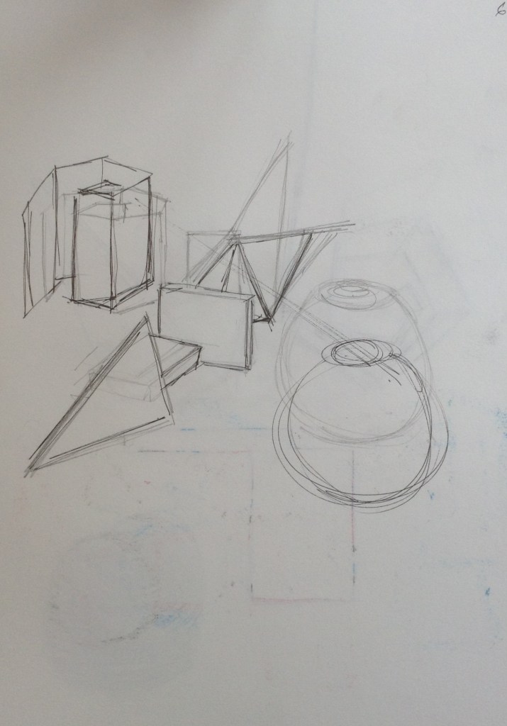
Once I started to sketch the composition, I noted that depending on the angle of my view, I had a view of two and three-dimensional forms at the same time. In addition, by tilting the perspective of the picture plane in my sketchbook it flattened elements of the composition. Having now deviated from the course content for this exercise I felt that this observation provided a different perspective. (See figure 2 and 3)
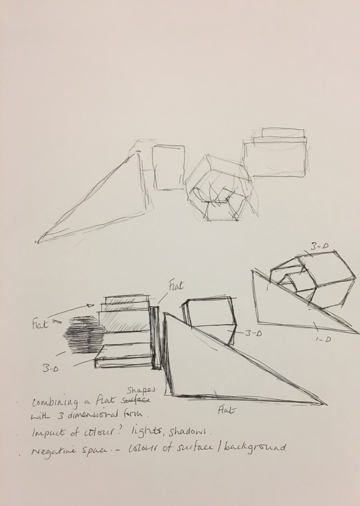


Within abstract painting, colour itself becomes the illusion as irregular forms materialize energetically in the spatial relationship between intense primary colours and white and black. My objects and the surroundings were predominantly white or grey.
Perhaps what is less evident from the photograph shown as figure 1, are the textures and physical qualities of the objects. Knowing that texture can be an expressive tool to reinforce an effect, feeling each object with my eyes closed accentuated the texture of each object. The lining paper that was covering the tabletop had a soft fibrous, velvet like texture that was smooth to the touch. In contrast the oval shaped cardboard maquette was rough around sides, with smooth surfaces at the top and bottom.
To replicate this, I experimented by adding materials and mediums to acrylic paint, such as sawdust, modelling paste, sand-gravel mix and a readymade filler.
My mind map (see figure 2 and 3 above) had generated various ideas, which I had managed to whittle down to three that I would develop further on a larger oil paper support. These were a view from a single viewpoint, a view from multiple viewpoints and a collage. Due to the drying time of my oil paint and other mediums all three were on the go at the same time.
Single viewpoint
I started with a charcoal drawing before using grey hues of acrylic paint to mark lines and block in the shape of each object. (See figure 4) With a mix of modelling paste and readymade filler I introduced texture to the edges of the rectangle forms in the foreground and oval structure to the bottom right of the picture. (See figure 5) Once dry grey oil paint, diluted with a 50/50 mix of linseed oil and turpentine was painted over the whole surface. Whilst still wet, this was wiped over with a cotton cloth. (See figure 6)
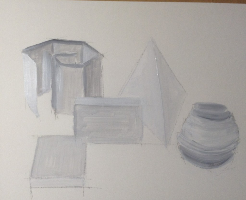
Fig. 4. 
Fig. 5. 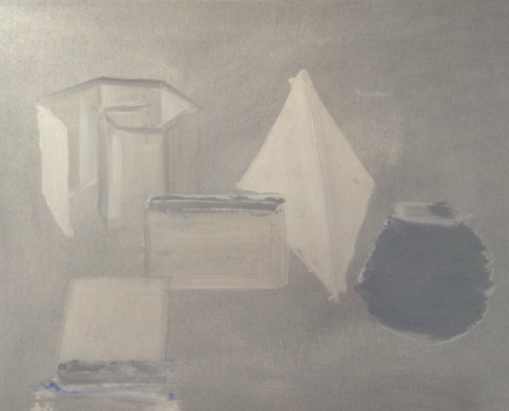
Fig. 6.
A few weeks later, and once completely dry, I applied coloured oil paints. (See figure 7). During my research I had referenced the techniques of Léger, Hofmann and Heilmann and their use of form, line and colour to create an optical space.
Eliminating or isolating some of these elements (form, line and colour) and reducing tonal values, produced and interesting outcome, albeit by chance. (See figure 7)

Multiple viewpoints
Mindful that I was venturing into project 3, I decided to explore and experiment with the spatial relationships between objects and the edges of the paper and how colour, line and form might impact on this relationship.
I started with charcoal drawings (See figure 8) before introducing modelling paste and readymade filler as shown in figure 9. The readymade filler (within the green tape) was applied with a palette knife and dabbed with a sponge to create an uneven texture. Once dry, grey oil paint diluted with a 50/50 mix of linseed oil and turpentine was painted over the whole surface. Whilst still wet, this was wiped over with a cotton cloth. (See figure 10)
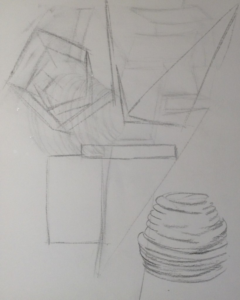
Fig. 8 
Fig. 9 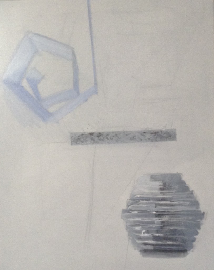
Fig. 10
A week or two later, and once dry, I used oil paints and a linseed oil medium to add colour. I included tonal variations for some of the objects, but I didn’t want these to suggest a relationship between objects. I had previously made a paper weave and although not included in the tabletop composition I felt that I could introduce the concept into the painting.
Whilst I worked on other exercises this piece was left on the easel to dry. As a result I had to work from photographs when finishing. (See figure 11)

Reflection
My selected objects all have personal sentiment which allowed me to contextualise their relationship to one another, be that a place or time. By mimicking these forms in a simple composition, and using colour and line, I had started to develop an understanding of their spatial relationships on the table, void of sentiment to the viewer.
I found the shape, surface and texture of objects appealing which contrasted sharply against the coldness of smooth coloured card. The table covering has a soft, warm velvet like texture which I found difficult to replicate., and indeed lost when in favour for the bright white colour. Running a hand across the surface of the painting produces an array of textures and feelings.
Changing the viewpoint masked some of competing colours which overlap in the centre of the canvas. The red horizontal line became lost, its colour muted and overpowered by the scale of the other objects.
The use of texture and mixed media to create material qualities is an area I will continue to explore further. Although I feel that had started to develop an understanding of the relationship between the objects and the space around them, their spatial relationships to the picture plane and that beyond it, I had well and truly been taken beyond my comfort zone – which I absolutely embrace, but also look forward to exploring further in a creative process.
The key points I shall take forward from this exercise are ‘material qualities’ and the spaitial relationship between the object/composition and the picture plane.
References:
Artnet.com. (n.d.). Léon Gischia | artnet. [online] Available at: http://www.artnet.com/artists/l%C3%A9on-gischia/ [Accessed 26 Feb. 2020].
Fitzpatrick, D. (2004). The interrelation of art and space: An investigation of late nineteenth and early twentieth century European painting and interior space. Masters of Art. Washington State University.
Nationalgallery.org.uk. (2020). Edouard Vuillard (1868 – 1940) | National Gallery, London. [online] Available at: https://www.nationalgallery.org.uk/artists/edouard-vuillard [Accessed 26 Feb. 2020].
Stratton, M. (2017). [online] Madelineastratton.com. Available at: https://www.madelineastratton.com/ [Accessed 25 Feb. 2020].
The Art Story. (n.d.). Medium Specificity and Flatness – Modern Art Terms and Concepts. [online] Available at: https://www.theartstory.org/definition/medium-specificity-and-flatness/ [Accessed 25 Feb. 2020].
Zimmerman, J. (n.d.). [online] Jacobrzimmerman.com. Available at: https://www.jacobrzimmerman.com/sculpture [Accessed 25 Feb. 2020].
