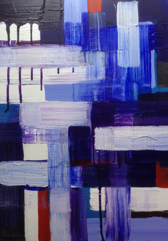
Sketchbook 1. Pages 46-51

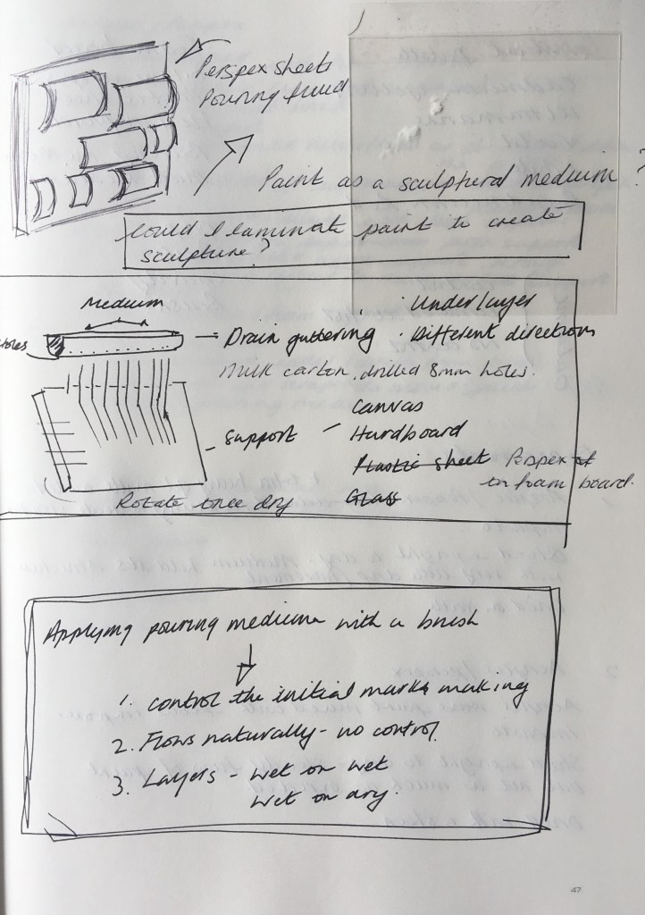


The aim of Assignment 4 was to develop a series of pieces, based on the ideas, approaches and reflections explored in Part Four; deconstruction and reconstruction of the canvas; painting as a sculptural medium before; alternative painting media and the relationship to materials and/or colour.
To narrow such a wide scope without being prescriptive or restricting options that I may wish to explore and develop was challenging. As such, this series of works explores the viscosity of materials and expands on experimenting with materials, mediums and techniques from each exercise during Part 4.
As part of this assignment, in addition to looking at the works referenced by directed research points, I also looked at the works of other artists who use materials such as plastic and perspex as a support in their artworks.
Mary Martin (1907-1969) used geometrical shapes of painted perspex that are simply arranged. Incorporating an extensive background that complements the coloured hues of the perspex challenges the viewer’s perception of the picture plane. An example of this is Perspex Group on Orange (B) 1969. This sculptural painting also challenged my perception of whether I was looking at a three-dimensional form, or was I looking through it? There are many examples of her works and collaborations of her work that raised similar questions.
Lynda Benglis’s use of latex to explore paint as a material also inspired and influenced my thought process, although as I discovered, acrylic paint was no substitute for latex.
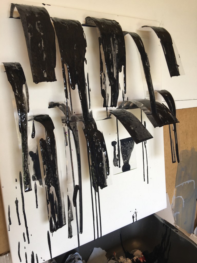
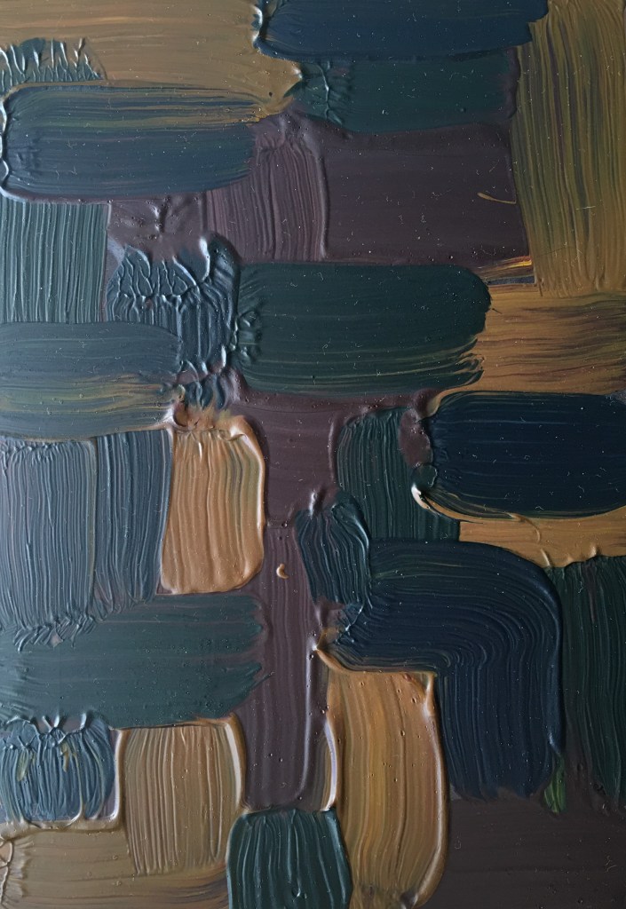
Combining Martin’s and Benglis’s techniques and use of materials, I experimented with 0.01mm perspex that I had cut into irregular lengths and widths. These were inserted into slits I had made on a stretched canvas which were taped on the reverse to hold them in place. (See Figure 1)
Black acrylic paint mixed with pouring medium and matte medium was poured onto the perspex strips. The effect was not as expected as the dimensions of the perspex strip and the amount of medium that was poured or dripped onto it created different responses. Shorter pieces of perspex sprang up and stuck to the canvas as the weight of the medium dripped off the edge. Overlapping strips became connected as the medium acted like a glue between the thin film of clear perspex. (See Figure 2)
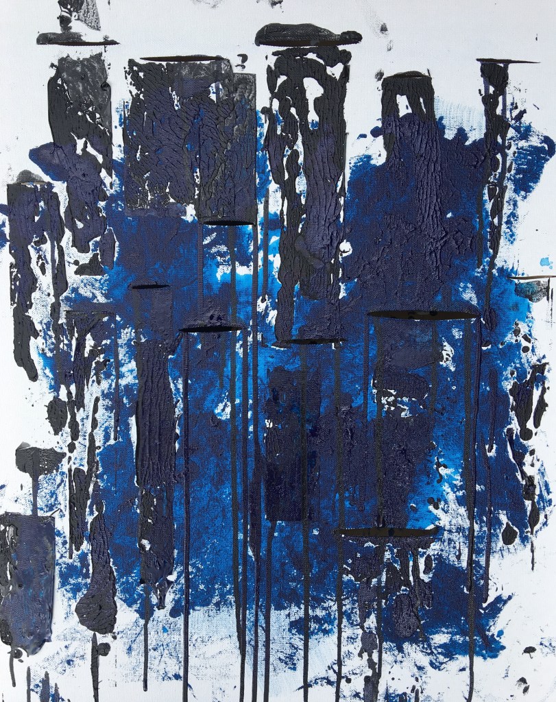
Removing the perspex of the canvas where it had previously sprung up created a patterned texture and led me to remove all the perspex strips from the slits in the canvas. These were laid flat on the canvas. After a couple of minutes, they were removed leaving a residue of the mixed media that had been poured previously. (See Figure 3)
Using ultramarine and Parisian blue acrylic paints (without any added pouring medium), this exercise was repeated three times, allowing the paint to dry between each layer. (See figure 4)
In the process of uploading these photographs, I was taken by the shadows and the effect of light travelling through the perspex as seen in Figure 1. I hadn’t observed this at the time of preparing the canvas but in retrospect felt it conveyed a sense of space around the picture plane. It also enticed me to research the works of Tim Noble and Sue Webster’s shadow sculptures and other forms of shadow art.


Acrylic and mixed medium on canvas
50×60 cm
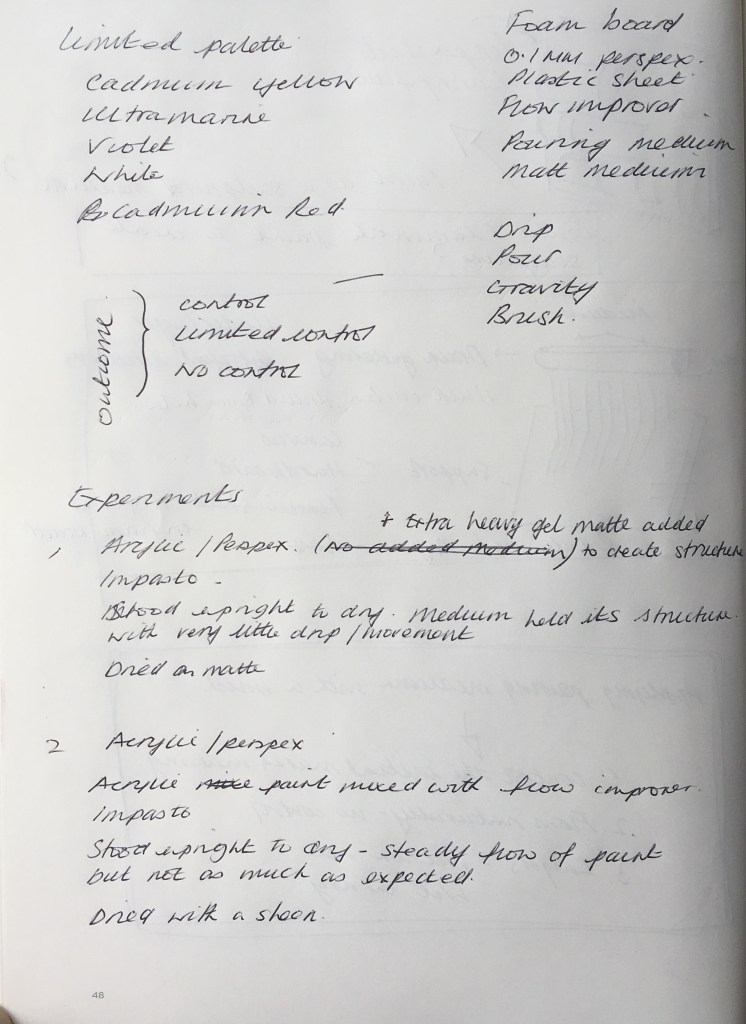
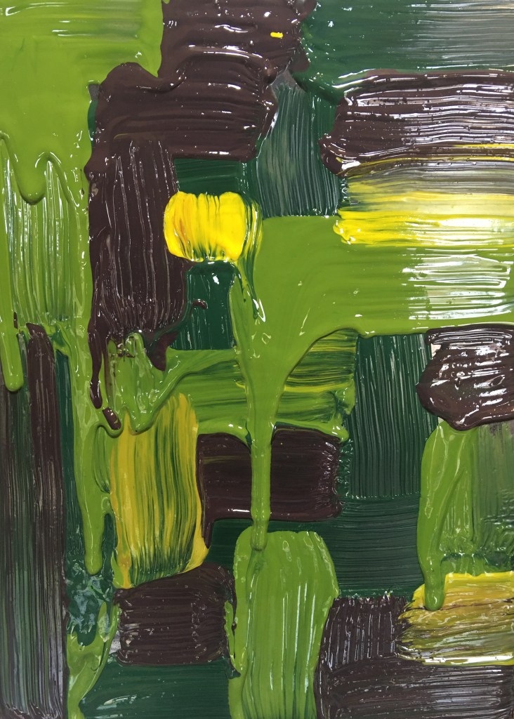
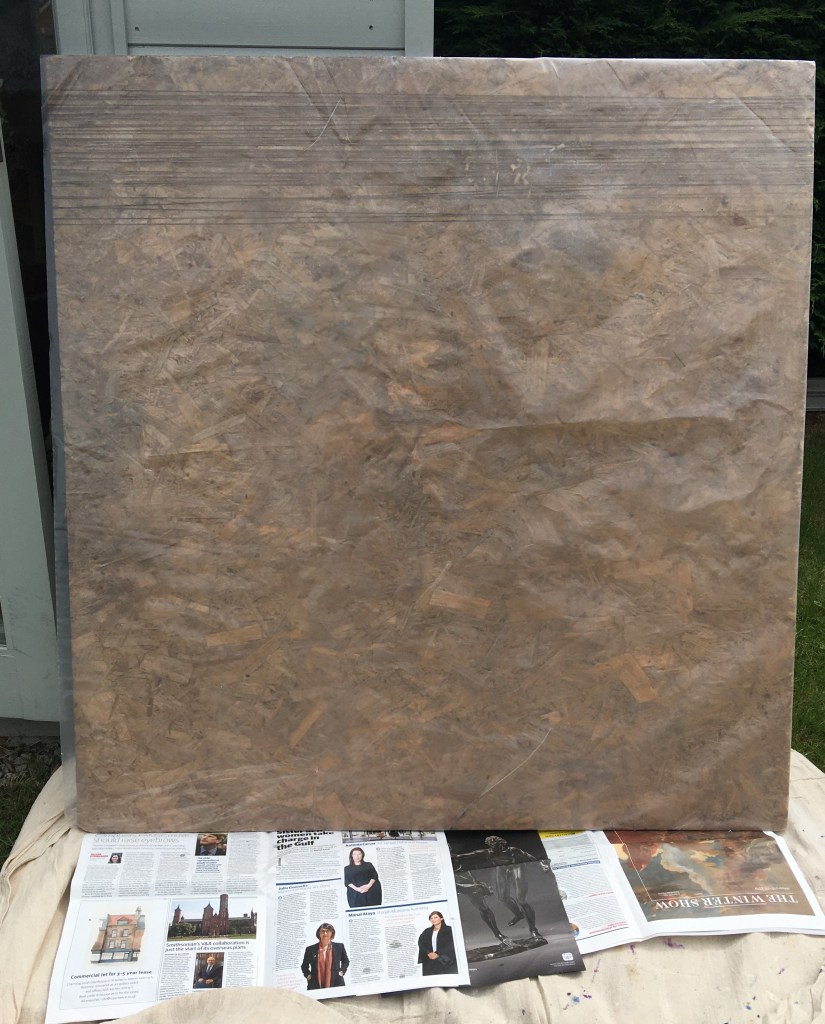
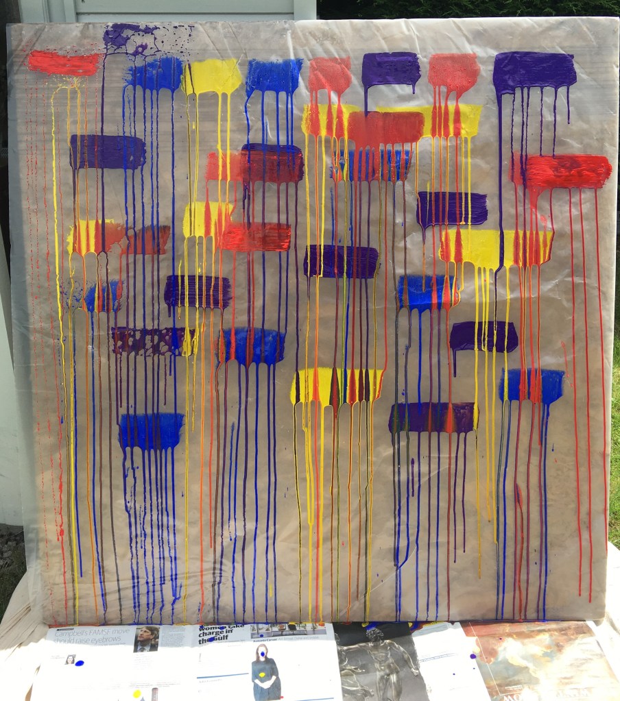
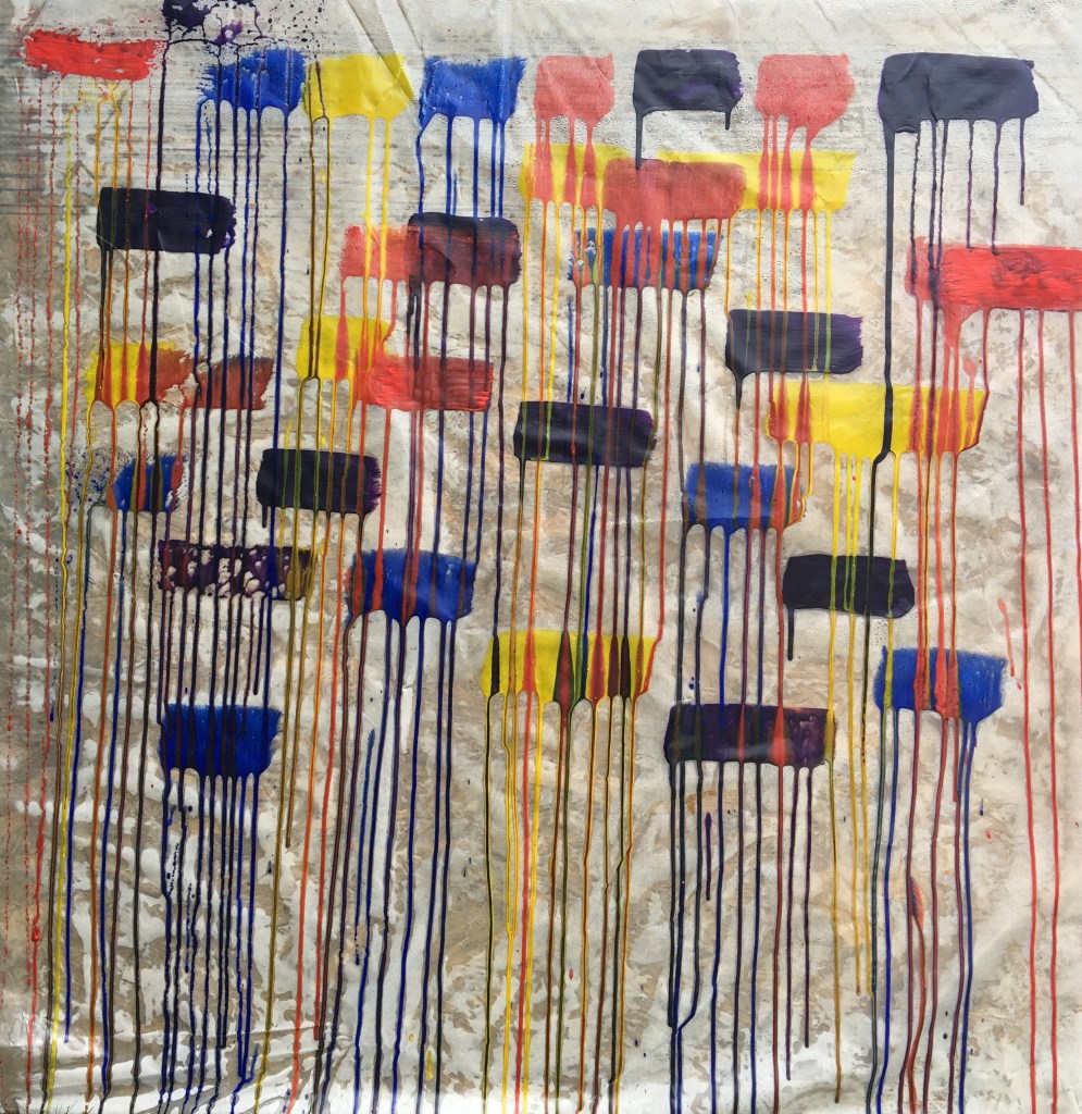
Having previously explored paint as a material, the outcome was a series of skins and structures that were created from painting or pouring acrylic, mixed with pouring medium, onto perspex or plastic which once dry could then be peeled as a pliable structure. Having researched artists who had used perspex as a support I explored this concept further, examining the compatibility of medium and materials. As the perspex was only 0.01 mm thick it was mounted onto a foam board to add rigidity.
With a limited palette of predominantly binary colours, these were mixed with an extra heavy matte gel of varying ratios of paint to gel. Mark-making was varied to explore different effects which then changed the texture and form of the material. The board was stood vertically to dry although the heavy gel retained its structure (See Figure 5).
The outcome challenged competing senses that the brain found difficult to compute. Was it rough or smooth to the touch, rigid, pliable, wet or dry? Delightfully ambiguous.
21.5×30 cm
The ambiguity was teasing but to push this further I wanted to overload the support, overload the brush with paint and observe an outcome develop.
Using a limited palette of cadmium yellow, ultramarine and violet acrylic paints, colours were mixed in separate pots and diluted with a flow improver. This was the first time I had used a flow improver so I was unsure how much to add or the impact this would have.
Paint was applied when the support was flat before being stood vertically to observe the effect each element had on the other. Having anticipated something a little more dramatic it was disappointing to observe a slow and isolated drip mark eventually form. However, this did provide a benchmark for the use of flow improver and with time more paint trickled down the support. No sooner had it started to flow – it also started to dry. (See figures 6 – 8)


21.5×30 cm
Working with pouring mediums and a flow improver on a small support requires a different way of working – and that is quick.
Having applied random blobs of acrylic paint directly from the tube onto a perspex support, cadmium yellow was mixed with a pouring medium and poured over the top. Tilting the support back and forth so the pouring medium ran across the blobs of paint.
I had expected the pouring medium to pick up traces of the ultramarine and violet as it moved across the support – but as these two colours had not been diluted, they were almost impenetrable to the pouring fluid.
Laying the support flat I used the back of a scalpel blade to create criss-cross marks across the support, breaking down the structure and viscidity of the ultramarine and violet paints. The support was once again tilted back and forth as the paints began to merge. This was repeated serval times (See Figure 9).

21×30 cm
In reverse to the previous exercise, a pouring medium was applied to a perspex support. Cadmium yellow, ultramarine and violet acrylic paints were applied directly (in random blobs) onto it. Using a paintbrush, scraper, hair clip and gravity, the blobs of paint were pulled through the pouring medium. It dried to leave the appearance of a gloss tile. (See Figure 10)

21×30 cm
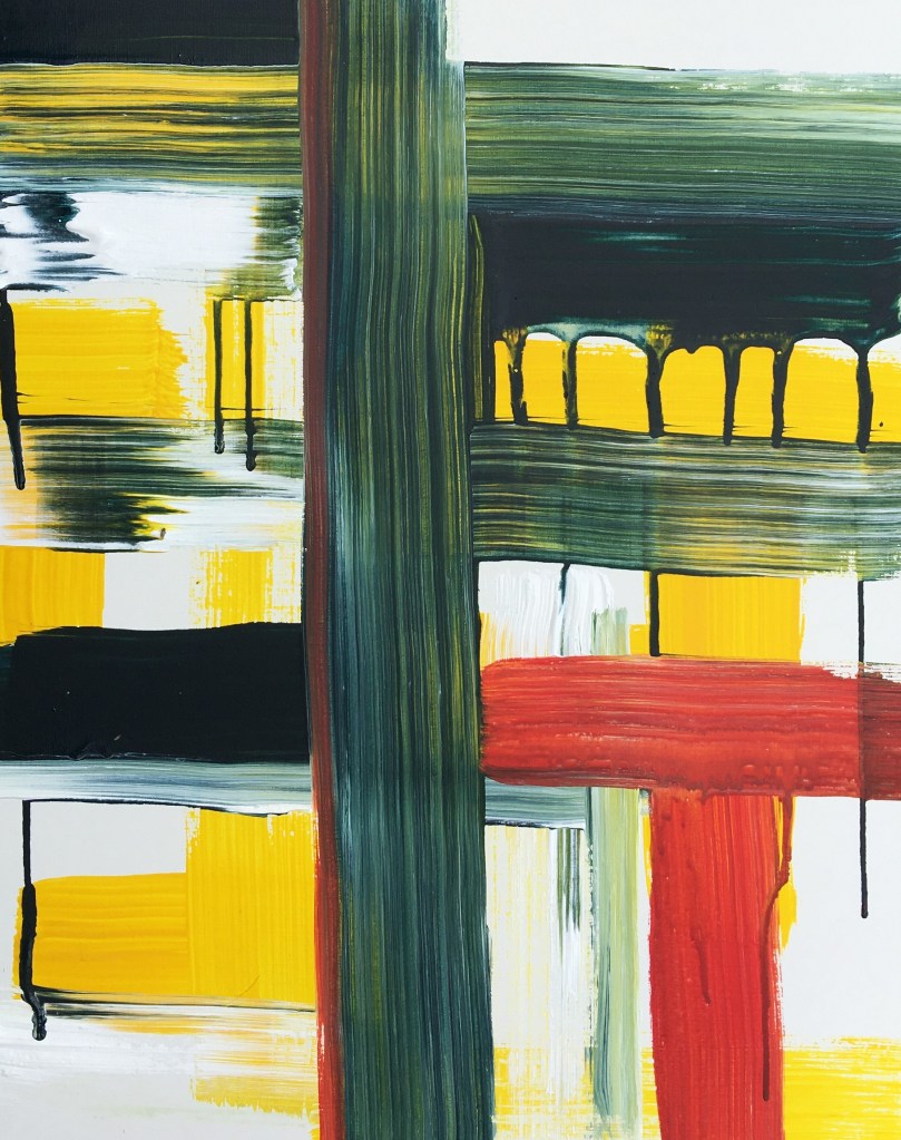
During my research, I came across the work of Andy Whorlow. His piece called ‘Drip Accumulator’ is based on the principles of time slowly dripping away through different paths and channels, in different directions and at different speeds, charting the passing of time. (ww.saatchiart.com, 2020)
How the artist used blocks of red paint and structural vertical and horizontal black lines, and the cascade of paint was interesting and alluring. Although it may look natural and self-directing it had been carefully controlled. (See Figure 11)

Having routinely expressed my thoughts regarding the control an artist has, or requires, in the outcome of a piece of work, I decided to test this by reacting to the piece as it developed; perhaps not to the extent of Whorlow’s Drip Accumulator, but with an ability to change or influence the outcome – if I required.
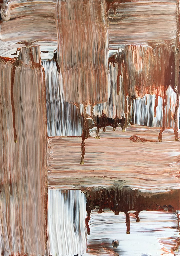
With a limited palette of two acrylic paint colours; a reddish brown and titanium white, the former was diluted with a flow improver. The titanium white was applied in its natural constancy.
The paint was applied to perspex with a 2″ firm bristle brush whilst the support was in a vertical position, allowing the paint to drip when being applied. Marks were made in response to the previous mark or natural flow of the paint. It would have been tempting to keep tweaking and thus knowing when to stop became equally as important.
Working on a stretched canvas support, and keeping with a limited palette of cadmium red, cadmium yellow and ultramarine, these colours were mixed with varying ratios of flow improver. Titanium white was used in its natural form.
Like the previous exercise, the support was vertical in a studio easel whilst painting, and I responded to my own mark-making and the flow of the medium. (See Figure 13)
Working on a canvas support the response was quite different. The bite of the canvas became evident and the concentration of medium to paint was greater. It also required more interaction which resulted in the colours being blended on the support. The titanium white, applied in its natural form, acted as a barrier that either slowed or stopped the flow of the diluted paints.
When reflecting on figures 12 and 13, I felt that it conveyed a sense of depth, perspective, (albeit two-dimensional and in an abstract manner) and movement that was reflective of the relationship between mediums and the support.
The paintings of Franz Kline’s Blueberry Eyes (1959-1960) feature fluid, thick brushstrokes that intersect, overlap, and interact with one another. They play with negative space to colourful compositions full of energy.
Piet Mondrian’s neoplasticism focused on the simplification of form and tone—namely, on the use of lines and primary colours. This aesthetic pair was intrinsic to Mondrian’s practice, as he believed that “everything is expressed through relationship. Colour can exist only through other colours, dimension through other dimensions, and position through other positions that oppose them. That is why I regard the relationship as the principal thing.” (Richman-Abdou, 2017)

https://mymodernmet.com/ Photo: SAAM

https://mymodernmet.com Photo: Guggenheim
The middle ground to the opposing styles and techniques of Kline and Mondrian is the relationship between each element; mark making, colour, positive and negative space. To explore this notion of ‘relationships’ and reflect on the techniques of Kline and Mondrian, I developed a piece of work over several days that intended to test and stretch the boundaries of this relationship.
In keeping with the colours used in the artworks shown in Figures 14 and 15, a limited palette of ultramarine, violet, cadmium red and titanium white was used for this exercise. The support was perspex mounted on a black foam board.
With the support laid flat, I started with a series of marks that buffered against one another without overlapping. Colours were mixed with a small quantity of flow improver and applied with a 1″ and 2″ brush. (See Figure 16) Once dry – this process was repeated with tonal variations of the original paint colures, but without adding a flow improver. (See Figure 17)
As the piece developed a relationship was expressed through overlapping and interacting brush marks and colour. (See Figure 18) This led me to consider if this relationship would be deconstructed if the boundaries of line and colours were blurred.


To examine this idea further, the support was secured vertically in an easel. Using the ultramarine and violet acrylic paint diluted with flow improver, and titanium acrylic white in its natural form, vertical and horizontal marks were made.
The outcome was somewhat indifferent. Some of the marks appear isolated or independent of one another due to their sharp contrast in colour or tone, whereas others form a more aesthetic relationship. I liked how the piece appears in a state of dysphoria as these elements jostle for attention. (See Figure 19)
The artist Ian Davenport examines the flow of paint to create compositional variety and complexity in a way that he considers himself a conductor rather than a painter. (Ian Davenport: Cadence, 2016)
I like the thought of conducting a piece of work, perhaps not on the scale of f Yves Klein performance art, but more refined within the parameters of this exercise.
The impact of Davenports’ installations is also their scale. The largest piece of material I had available was a sheet of plastic that had previously been covering a pile of logs. With the plastic tacked to an MDF board I applied horizontal brush marks of cadmium red, cadmium yellow, ultramarine, and violet acrylic paints. The consistency of the flow improver was adjusted to create a medium that would flow and keep its structure on plastic.
Whilst still wet, the plastic was removed from the MDF board and pegged to a rotary clothesline to dry.
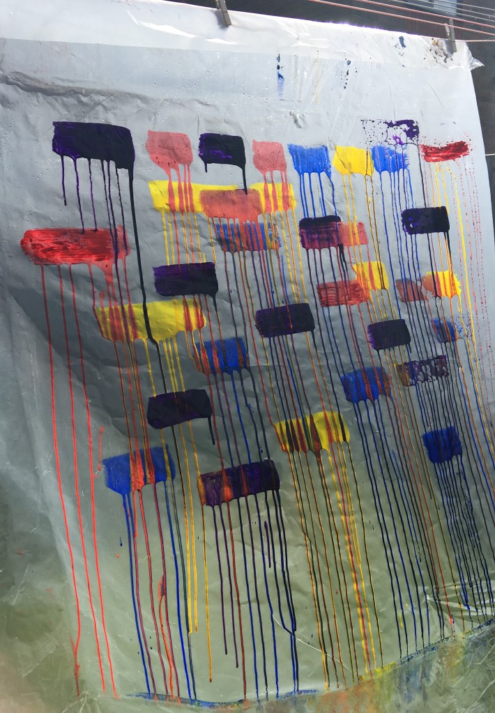
I liked the interaction of colours as they streamed down the surface of the support, an accelerated and colour vision of raindrops running down a pane of glass. An observer rather than a conductor, and despite the creases and folds in the plastic the law of gravity created vertical lines. (See Figure 21)

References
Davenport, I., 2020. Painting. [online] Ian Davenport. Available at: <https://www.iandavenportstudio.com/paintings/categories/6/> [Accessed 27 June 2020].
Richman-Abdou, K., 2017. 9 Abstract Artists Who Changed The Way We Look At Painting. [online] My Modern Met. Available at: <https://mymodernmet.com/abstract-artists/> [Accessed 27 June 2020].
Waddington Custot. 2016. Ian Davenport: Cadence. [online] Available at: <https://www.waddingtoncustot.com/news/96/> [Accessed 28 Jun 2020].
Review against Assessment criteria
Demonstration of Technical and Visual Skills: By interpreting the brief of the course handbook, I felt that I was able to develop ideas that demonstrated both technical and visual skills by using a range of processes and media. I really enjoyed the process of experimenting with colour to create a 3D colour chart, perhaps because I was comfortable with the concept. In contrast, I found the idea of using unconventional painting materials difficult to embrace.
Quality of outcome. There is a fine and delicate balance between letting the materials behave the way they will, and the amount of control applied by the artist. Whilst I have experimented, this alchemy of working would require dedicated refinement to understand where this balance sits. As, the outcomes differ from one exercise to the next, some of which are disappointing. I am reasonably pleased with the process but having challenged my own preconceptions during part 4, I question whether I have conveyed my understanding of the materiality of materials as best I could. There are aspects of part 4 which I will continue to explore through my parallel project, including, colour, texture using unconventional materials and the sensitivity of my work. The use of acrylic as a skin made me reflect on how I could use this to create form and texture alongside other materials.
Demonstration of creativity. By thinking beyond the realms of my own inhibitions I was able to develop ideas and resolve problems, a journey of process rather than successful outcomes. There are probably only so many ways in which you can deconstruct a canvas and mine was not necessarily innovative. However, deconstructing the canvas and thinking about how it could be used differently opened my mind to explore other materials that could be used or repurposed. My own curiosity to examine often the most random ideas meant that I was easily side-tracked in taking risks in pursuit of the ‘what if’.
Context: I feel that my research has demonstrated knowledge of artists and art movements. However, I am mindful that I must articulate the impact or influence of this research in my work, which is an area for personal development. I do enjoy the research, and I find one piece of work often leads to another. Researching the works of Sillman and her fascination with paint as a material was stimulating. Sillman’s work is on display at Tate Liverpool – which I will now view from a different perspective.
